API Reference - @liveblocks/react-comments
@liveblocks/react-comments provides you with React
components to build a commenting experience. Read our
getting started guide to learn more.
Default components
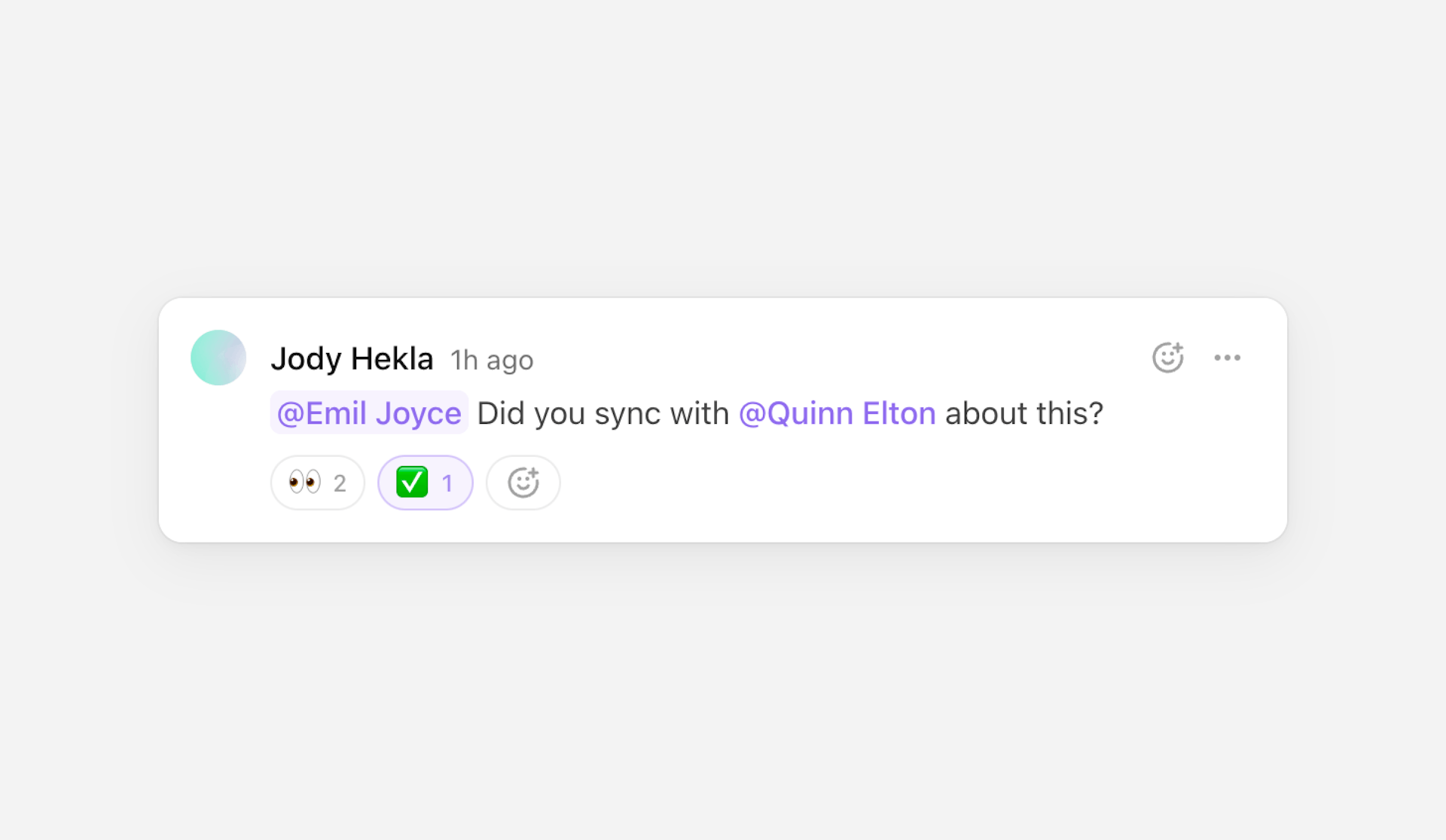
Thread
Displays a thread of comments. Each thread has a composer for creating replies.
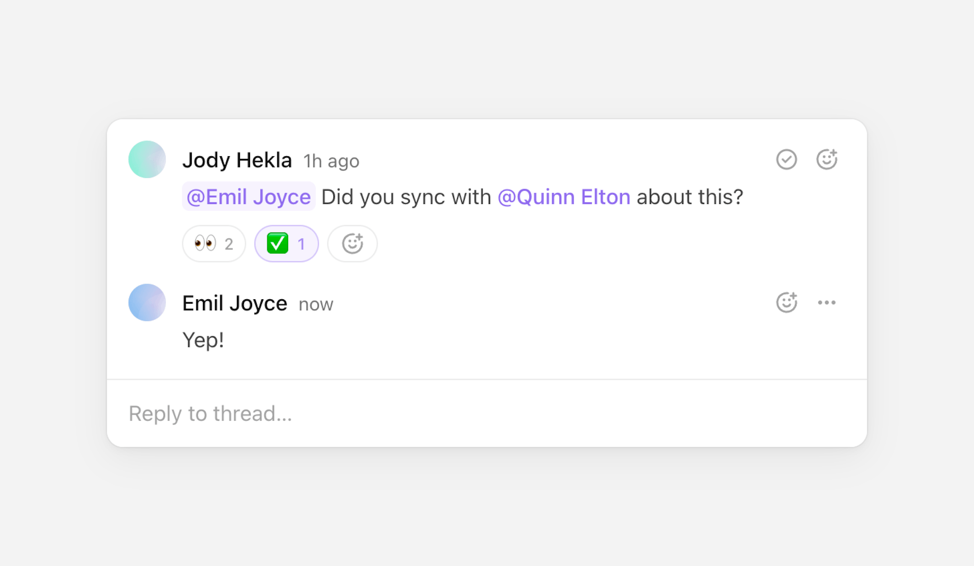
Map through threads to render a list of the room’s threads and comments.
Threads can be retrieved with
useThreads.
Resolved thread metadata
A thread allows you to attach custom metadata to it when using the
mutation hooks, and when
creating a thread with the composer. The Thread
component automatically adds the resolved property to metadata, and this
property is used to display a checkbox which denotes whether the thread has been
resolved or not.
If you’d like to use this, make sure to add the resolved property to
ThreadMetadata in your config file for valid type-checking.
Props
- threadThreadDatarequired
The thread to display.
- showComposerboolean | "collapsed"default: "collapsed"
How to show or hide the composer to reply to the thread.
- showActionsboolean | "hover"default: "hover"
How to show or hide the actions.
- showReactionsbooleandefault: true
Whether to show reactions.
- showResolveActionbooleandefault: true
Whether to show the action to resolve the thread.
- indentCommentContentbooleandefault: true
Whether to indent the comments’ content.
- showDeletedCommentsbooleandefault: false
Whether to show deleted comments.
- onResolvedChangefunction
The event handler called when changing the resolved status.
- onThreadDeletefunction
The event handler called when the thread is deleted. A thread is deleted when all its comments are deleted.
- onCommentEditfunction
The event handler called when a comment is edited.
- onCommentDeletefunction
The event handler called when a comment is deleted.
- onAuthorClickfunction
The event handler called when clicking on a comment’s author.
- onMentionClickfunction
The event handler called when clicking on a mention.
- overridesPartial<GlobalOverrides & ThreadOverrides & CommentOverrides & ComposerOverrides>
Override the component’s strings.
Composer
Displays a composer for creating threads or comments.
By default, submitting the composer will create a new thread.
Adding thread metadata
If you’d like to attach custom metadata to the newly created thread, you can add
a metadata prop.
Typed metadata
Optionally, you can type metadata by importing your custom ThreadMetadata
type from your config file.
Replying to a thread
If you provide a threadId, then submitting the composer will add a new reply
to the thread.
Modifying a comment
If you provide both a threadId and a commentId, then submitting the composer
will edit the comment.
Custom behavior
If you’d like to customize submission behavior, you can use
event.preventDefault() in onComposerSubmit to disable the default behavior
and call comment and thread mutation methods manually.
Learn more about mutation hooks under
@liveblocks/react.
Props
- threadIdstring
The ID of the thread to reply to or to edit a comment in.
- commentIdstring
The ID of the comment to edit.
- metadataThreadMetadata
The metadata of the thread to create.
- onComposerSubmitfunction
The event handler called when the composer is submitted.
- defaultValueCommentBody
The composer’s initial value.
- collapsedboolean
Whether the composer is collapsed. Setting a value will make the composer controlled.
- onCollapsedChangefunction
The event handler called when the collapsed state of the composer changes.
- defaultCollapsedboolean
Whether the composer is initially collapsed. Setting a value will make the composer uncontrolled.
- disabledboolean
Whether the composer is disabled.
- autoFocusboolean
Whether to focus the composer on mount.
- overridesPartial<GlobalOverrides & ComposerOverrides>
Override the component’s strings.
Comment
Displays a single comment.
Map through thread.comments to render each comment in a thread. Threads can be
retrieved with useThreads.
Custom thread components
Comment can be used in combination with Composer to
create a custom thread component. The composer in this example is used to
reply to the existing thread.
Props
- commentCommentDatarequired
The comment to display.
- showActionsboolean | "hover"default: "hover"
How to show or hide the actions.
- showReactionsbooleandefault: true
Whether to show reactions.
- indentContentbooleandefault: true
Whether to indent the comment’s content.
- showDeletedbooleandefault: false
Whether to show the comment if it was deleted. If set to
false, it will render deleted comments asnull. - onCommentEditfunction
The event handler called when the comment is edited.
- onCommentDeletefunction
The event handler called when the comment is deleted.
- onAuthorClickfunction
The event handler called when clicking on the author.
- onMentionClickfunction
The event handler called when clicking on a mention.
- overridesPartial<GlobalOverrides & CommentOverrides & ComposerOverrides>
Override the component’s strings.
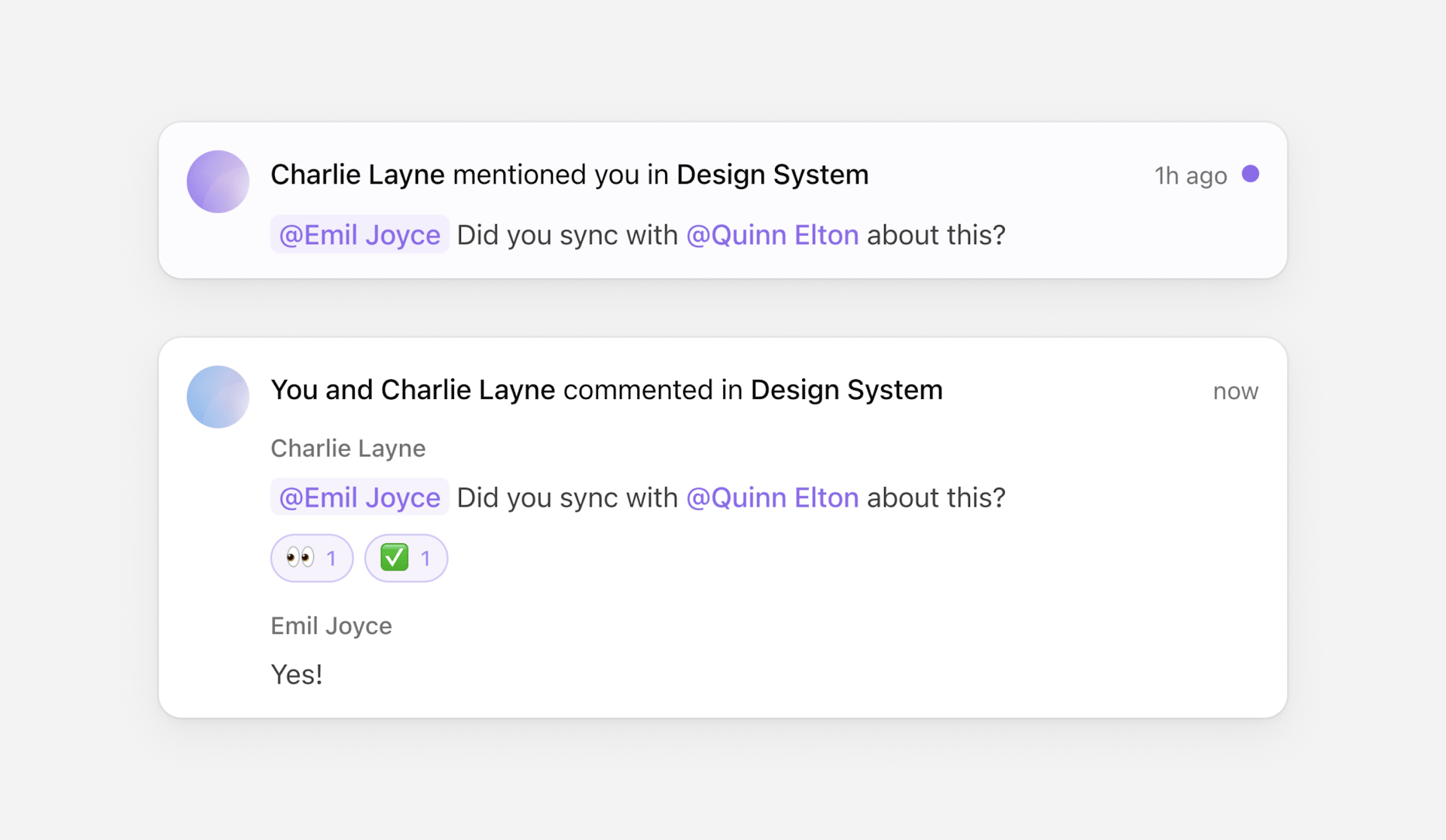
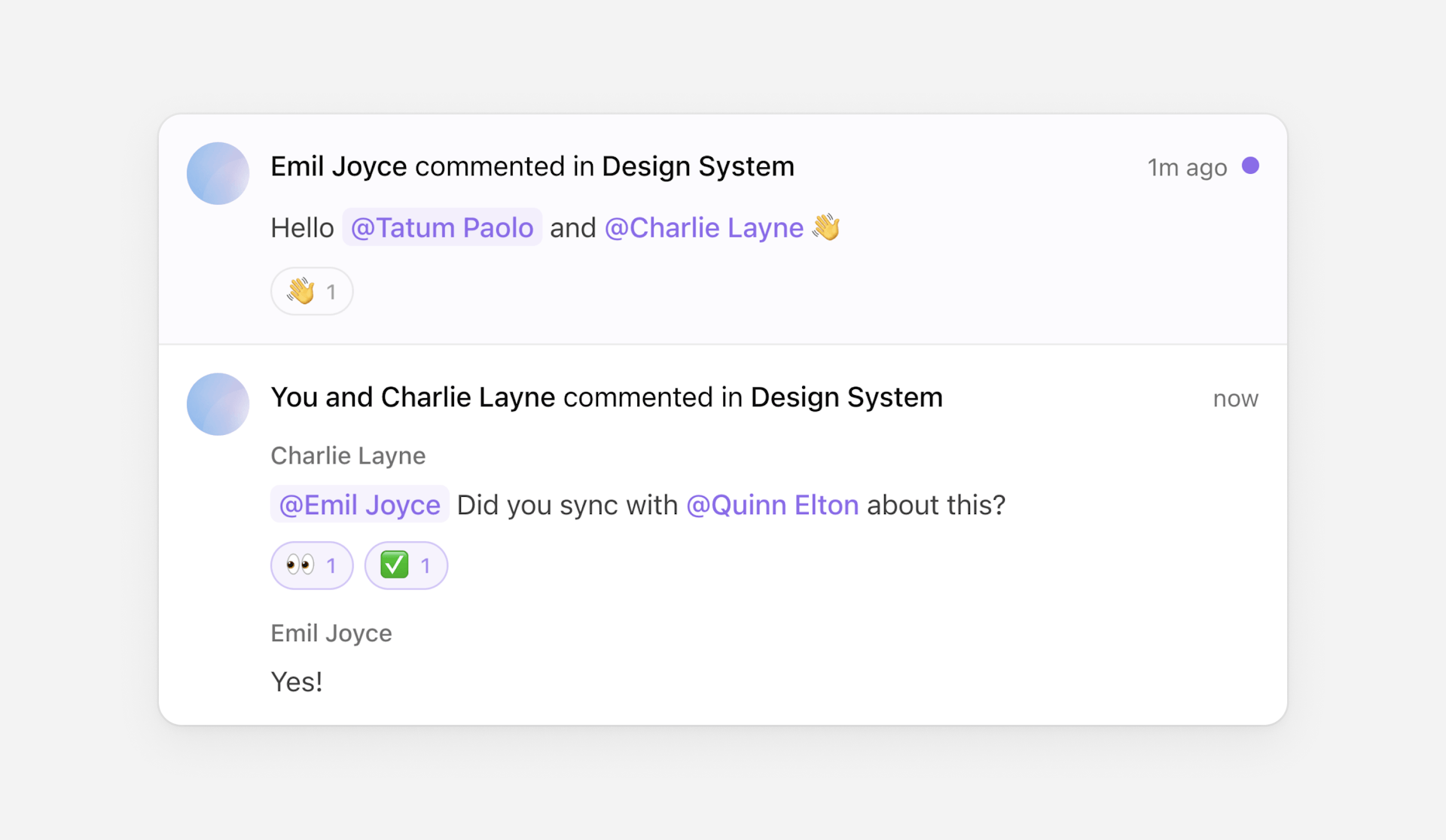
InboxNotification
Displays a single inbox notification.
Props
- inboxNotificationInboxNotificationrequired
The inbox notification to display.
- hrefstring
The URL which the inbox notification links to.
- showActionsboolean | "hover"
How to show or hide the actions.
- kindsPartial<InboxNotificationKinds>
Override specific kinds of inbox notifications.
- overridesPartial<GlobalOverrides & InboxNotificationOverrides & CommentOverrides>
Override the component’s strings.
- componentsPartial<GlobalComponents>
Override the component’s components.
kinds
Override specific kinds of inbox notifications.
- threadComponentType<InboxNotificationThreadProps>
The component used to display thread inbox notifications. Defaults to
InboxNotification.Thread.
InboxNotification.Thread
Displays a thread inbox notification.
- showActionsboolean | "hover"
How to show or hide the actions.
- showRoomNameboolean
Whether to show the room name in the title.
InboxNotificationList
Displays inbox notifications as a list. Each
InboxNotification component will be wrapped in a li
element.
Props
- childrenReactNode
The inbox notifications to display.
CommentsConfig
Set configuration options for all Comments components, such as overrides.
Props
- overridesPartial<Overrides>
Override the components’ strings.
- componentsPartial<Components>
Override the components’ components.
- portalContainerHTMLElementdefault: document.body
The container to render the portal into.
Styling and customization
Default styles
The default components come with default styles. These styles can be imported
into the root of your app or directly into a CSS file with @import.
Dark mode
You can also import default dark mode styling. There are two versions to choose from, the first uses the system theme.
The second uses the dark class name, and two commonly used data attributes.
CSS variables
The default components are built around a set of customizable CSS variables. Set
these variables within .lb-root to globally style your components.
- --lb-radiusdefault: 0.5em
The border radius scale.
emvalues recommended. - --lb-spacingdefault: 1em
The spacing scale.
emvalues recommended. - --lb-accentdefault: #1177ff
The accent color.
- --lb-accent-foregrounddefault: #ffffff
The foreground color used over the accent color.
- --lb-backgrounddefault: #ffffff
The main background color.
- --lb-foregrounddefault: #111111
The main foreground color.
- --lb-icon-sizedefault: 20px
The size of icons.
- --lb-icon-weightdefault: 1.5px
The stroke weight of icons.
- --lb-avatar-radiusdefault: 50%
The border radius used for avatars.
- --lb-button-radiusdefault: calc(0.75 * var(--lb-radius))
The border radius used for buttons.
- --lb-transition-durationdefault: 0.1s
The duration used for transitioned elements.
- --lb-transition-easingdefault: cubic-bezier(0.4, 0, 0.2, 1)
The easing function used for transitioned elements.
- --lb-elevation-shadowdefault: 0 0 0 1px rgb(0 0 0 / 4%), 0 2px 6px rgb(0 0 0 / 8%), 0 8px 26px rgb(0 0 0 / 12%)
The box shadow added to elevated elements.
- --lb-tooltip-shadowdefault: 0 2px 4px rgb(0 0 0 / 8%), 0 4px 12px rgb(0 0 0 / 12%)
The box shadow added to tooltips.
- --lb-accent-contrastdefault: 8%
Affects the lightness of accent colors.
%value required. - --lb-foreground-contrastdefault: 6%
Affects the lightness of foreground colors.
%value required.
Class names
Each default component has a set of predefined class names, which can be helpful for custom styling, for example.
Additionally, some elements also have data attributes to provide contextual information, for example:
Portaled elements
Floating elements within the default components (e.g. tooltips, drowdowns, etc)
are portaled to the end of the document to avoid z-index conflicts and
overflow issues.
When portaled, those elements are also wrapped in a container to handle their
positioning. These containers don’t have any specific class names or data
attributes so they shouldn’t be targeted or styled directly, but they will
mirror whichever z-index value is set on their inner element (which would be
auto by default). So if you need to set a specific z-index value on floating
elements, you should set it on the floating elements themselves directly,
ignoring their containers. You can either target specific floating elements
(e.g. .lb-tooltip, .lb-dropdown, etc) or all of them at once via the
.lb-portal class name.
Overrides
Overrides can be used to customize components’ strings and localization-related properties, such as locale and reading direction.
They can be set globally for all components using CommentsConfig:
Overrides can also be set per-component, and these settings will take precedence
over global settings. This is particularly useful in certain contexts, for
example when you’re using a <Composer /> component for creating replies to
threads:
Primitives
Primitives are unstyled, headless components that can be used to create fully custom commenting experiences.
Composition
All primitives are composable; they forward their props and refs, merge their classes and styles, and chain their event handlers.
Inspired by Radix (and powered by its
Slot utility), most
of the primitives also support an asChild prop to replace the rendered element
by any provided child, and both set of props will be merged.
Learn more about this concept on Radix’s composition guide.
Composer
Used to render a composer for creating, or editing, threads and comments.
Combine with
useCreateThread to
render a composer that creates threads.
Composer.Form
Surrounds the composer’s content and handles submissions. By default, no action
occurs when the composer is submitted. You must create your own mutations within
onComposerSubmit for
creating threads,
creating comments,
editing comments, etc.
- onComposerSubmitfunction
The event handler called when the form is submitted.
- asChildbooleandefault: false
Replace the rendered element by the one passed as a child.
Composer.Editor
Displays the composer’s editor.
- defaultValueCommentBody
The editor’s initial value.
- placeholderstring
The text to display when the editor is empty.
- disabledboolean
Whether the editor is disabled.
- autoFocusboolean
Whether to focus the editor on mount.
- dir"ltr" | "rtl"
The reading direction of the editor and related elements.
- componentsPartial<ComposerEditorComponents>
The components displayed within the editor.
| Attribute | Value |
|---|---|
data-focused | Present when the component is focused. |
data-disabled | Present when the component is disabled. |
components
The components displayed within the editor.
- MentionComponentType<ComposerEditorMentionProps>
The component used to display mentions. Defaults to the mention’s
userIdprefixed by an @. - MentionSuggestionsComponentType<ComposerEditorMentionSuggestionProps>
The component used to display mention suggestions. Defaults to a list of the suggestions’
userId. - LinkComponentType<ComposerEditorLinkProps>
The component used to display links. Defaults to the link’s
childrenproperty.
Mention
The component used to display mentions.
- userIdstring
The mention’s user ID.
- isSelectedboolean
Whether the mention is selected.
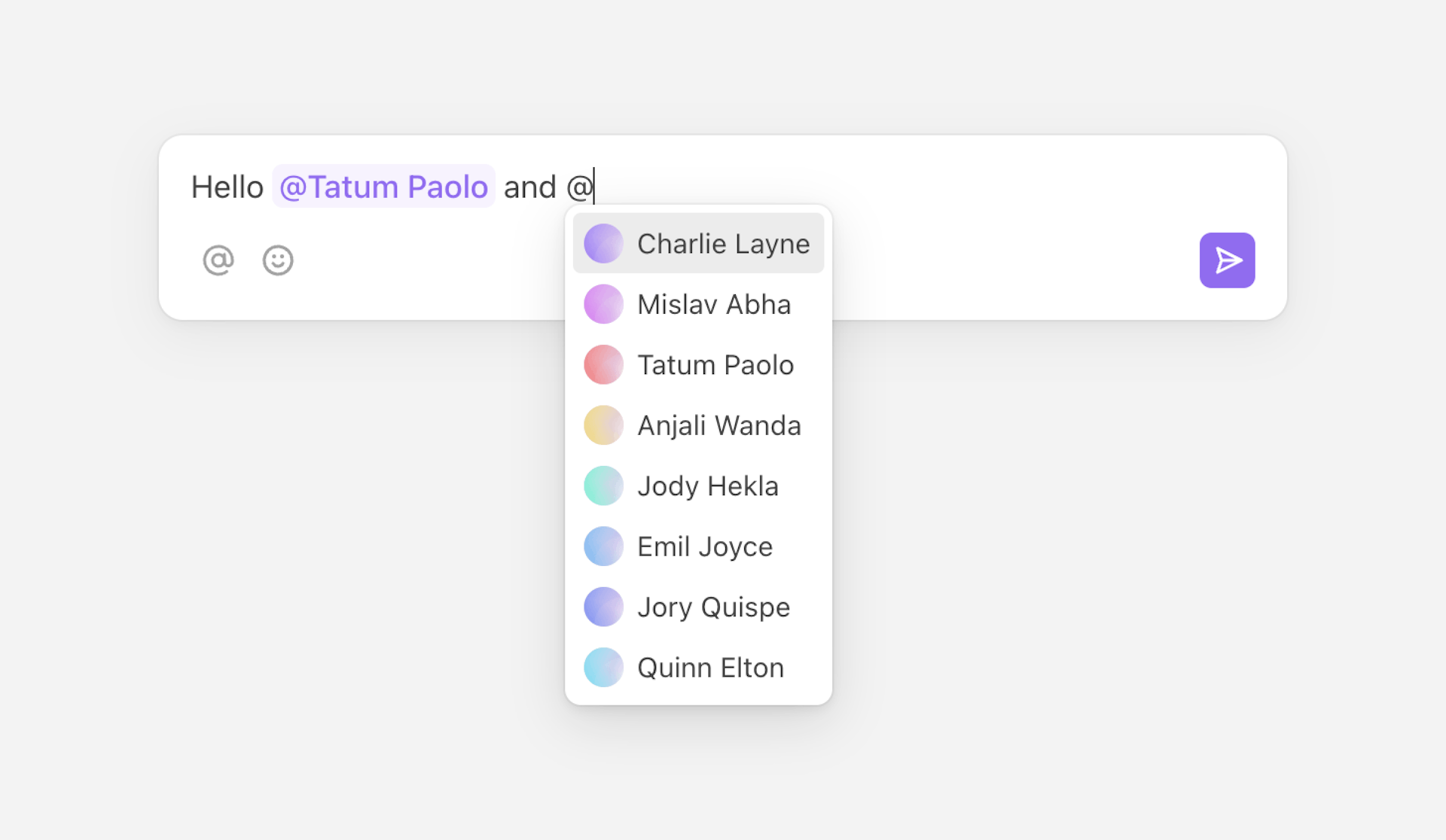
MentionSuggestions
The component used to display mention suggestions.
- userIdsstring[]
The list of suggested user IDs.
- selectedUserIdstring
he currently selected user ID.
Link
The component used to display links.
- hrefstring
The link’s absolute URL.
- childrenReactNode
The link’s content.
Composer.Mention
Displays mentions within Composer.Editor.
- asChildbooleandefault: false
Replace the rendered element by the one passed as a child.
| Attribute | Value |
|---|---|
data-selected | Present when the mention is selected. |
Composer.Suggestions
Contains suggestions within Composer.Editor.
- asChildbooleandefault: false
Replace the rendered element by the one passed as a child.
Composer.SuggestionsList
Displays a list of suggestions within Composer.Editor.
- asChildbooleandefault: false
Replace the rendered element by the one passed as a child.
Composer.SuggestionsListItem
Displays a suggestion within Composer.SuggestionsList.
- valuestringrequired
The suggestion’s value.
- asChildbooleandefault: false
Replace the rendered element by the one passed as a child.
| Attribute | Value |
|---|---|
data-selected | Present when the item is selected. |
Composer.Link
Displays links within Composer.Editor.
- asChildbooleandefault: false
Replace the rendered element by the one passed as a child.
Composer.Submit
A button to submit the composer.
- asChildbooleandefault: false
Replace the rendered element by the one passed as a child.
Comment
Used to render a single comment.
Map through thread.comments to render each comment in a thread. Threads can be
retrieved with useThreads.
Comment.Body
Displays a comment body.
- bodyCommentBody
The comment body to display. If not defined, the component will render
null. - componentsPartial<CommentBodyComponents>
The components displayed within the comment body.
- asChildbooleandefault: false
Replace the rendered element by the one passed as a child.
components
The components displayed within the comment body.
- MentionComponentType<CommentBodyMentionProps>
The component used to display mentions. Defaults to the mention’s
userIdprefixed by an @. - LinkComponentType<CommentBodyLinkProps>
The component used to display links. Defaults to the link’s
childrenproperty.
Mention
The component used to display mentions.
- userIdstring
The mention’s user ID.
Link
The component used to display links.
- hrefstring
The link’s absolute URL.
- childrenReactNode
The link’s content.
Comment.Mention
Displays mentions within Comment.Body.
- asChildbooleandefault: false
Replace the rendered element by the one passed as a child.
Comment.Link
Displays links within Comment.Body.
- asChildbooleandefault: false
Replace the rendered element by the one passed as a child.
Timestamp
Displays a formatted date, and automatically re-renders to support relative formatting. Defaults to relative formatting for recent dates (e.g. “5 minutes ago”) and a short absolute formatting for older ones (e.g. “25 Aug”).
Use with comment.createdAt, comment.editedAt, or comment.deletedAt to
display a human-readable time.
- dateDate | string | numberrequired
The date to display.
- childrenfunction
A function to format the displayed date. Defaults to a relative date formatting function.
- titlestring | function
The
titleattribute’s value or a function to format it. Defaults to an absolute date formatting function. - intervalnumber | falsedefault: 30000
The interval in milliseconds at which the component will re-render. Can be set to
falseto disable re-rendering. - localestring
The locale used when formatting the date. Defaults to the browser’s locale.
- asChildbooleandefault: false
Replace the rendered element by the one passed as a child.
Hooks
useComposer
Returns states and methods related to the composer. Can only be used within the
Composer.Form primitive.
This hook has a number of uses, for example constructing a custom button that submits threads, and disabling it when the composer input is empty.
Other hooks
Other Comments hooks are part of
@liveblocks/react, you can find them
on the
React API reference page.