Default components
The default components included in Comments are a great way to start building your application. With these components you can render entire threads, along with a comment composer.
- Fully styled commenting components, with an optional dark mode.
- Customize through CSS variables and class names.
- Localize and modify strings with overrides.
- Can be used alongside primitives.
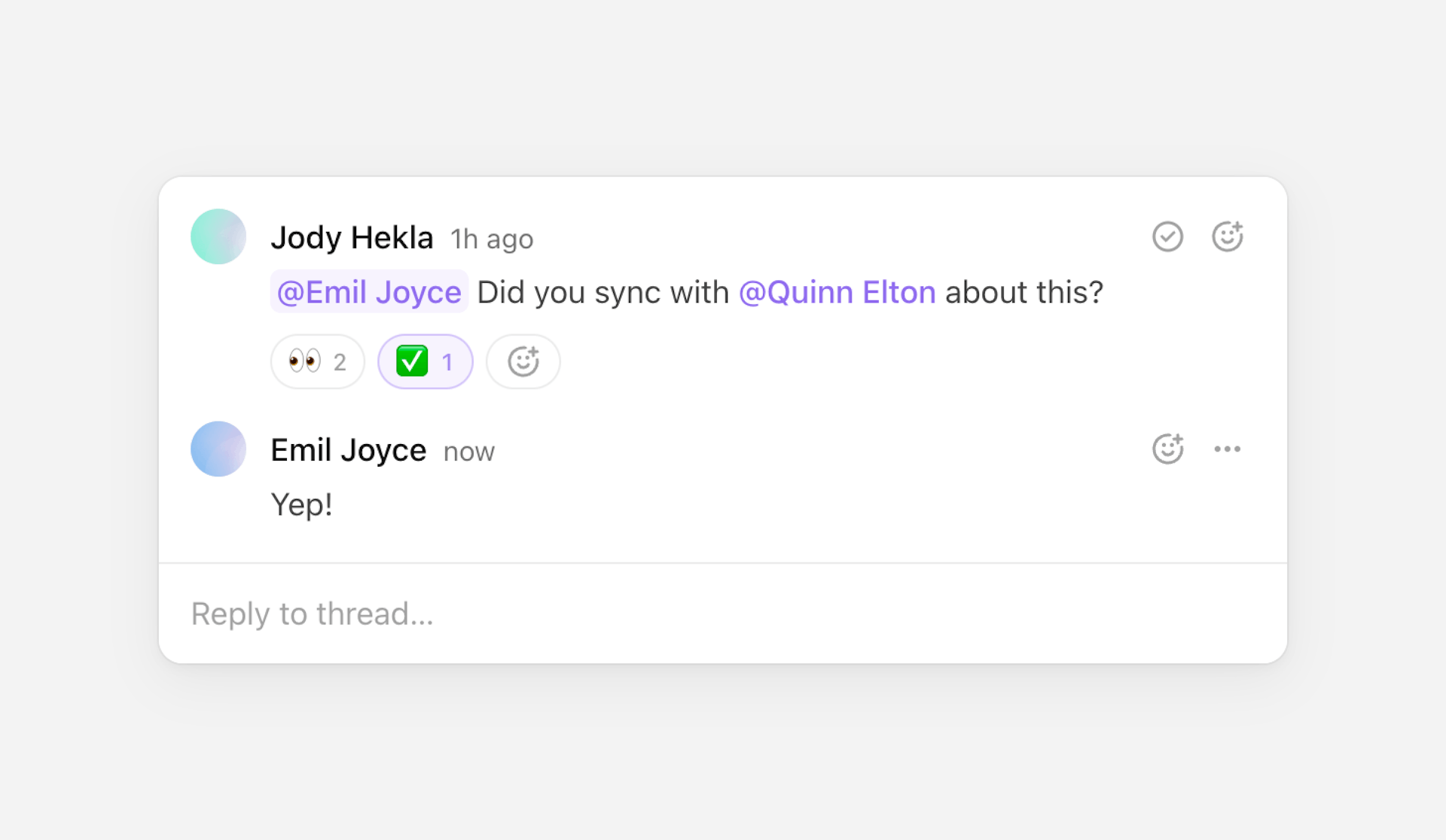
Thread
The Thread component renders a thread and its contained comments, as well
a composer for adding new comments to thread.
Usage
The best way to get started is to import the useThreads hook, and loop
through each thread in the current room.
This will render a list containing every thread in the room, each with its own composer for adding new comments.
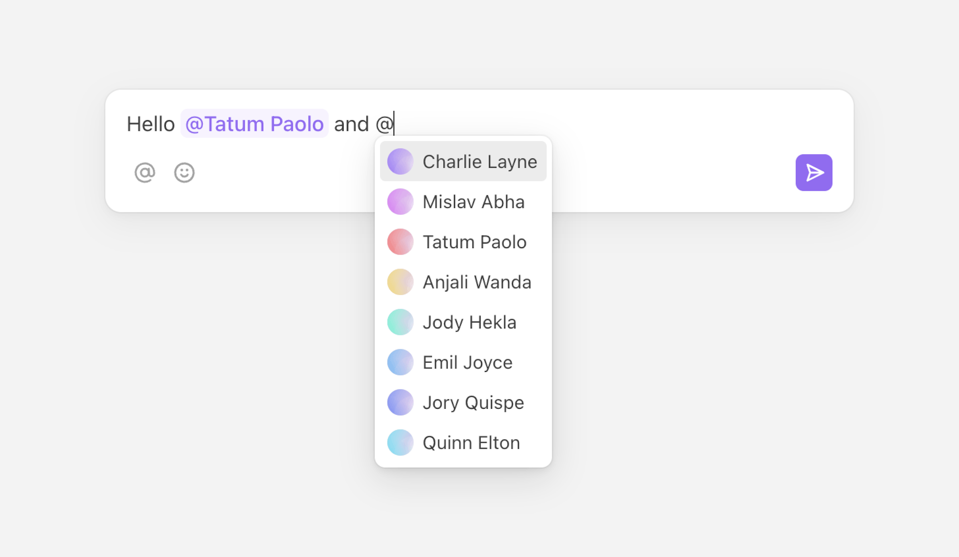
Composer
The Composer component renders a rich-text composer that’s used to create
new threads. It can also be used to add comments to an existing thread, or to
edit comments.
Usage
Get started by importing the component. By default, it’ll create a new thread when the form’s submitted.
Composer can also be used in other ways:
- Adding metadata to a new thread
- Creating private threads
- Replying to a thread
- Adding metadata to a reply
- Modifying a comment
- Custom behavior
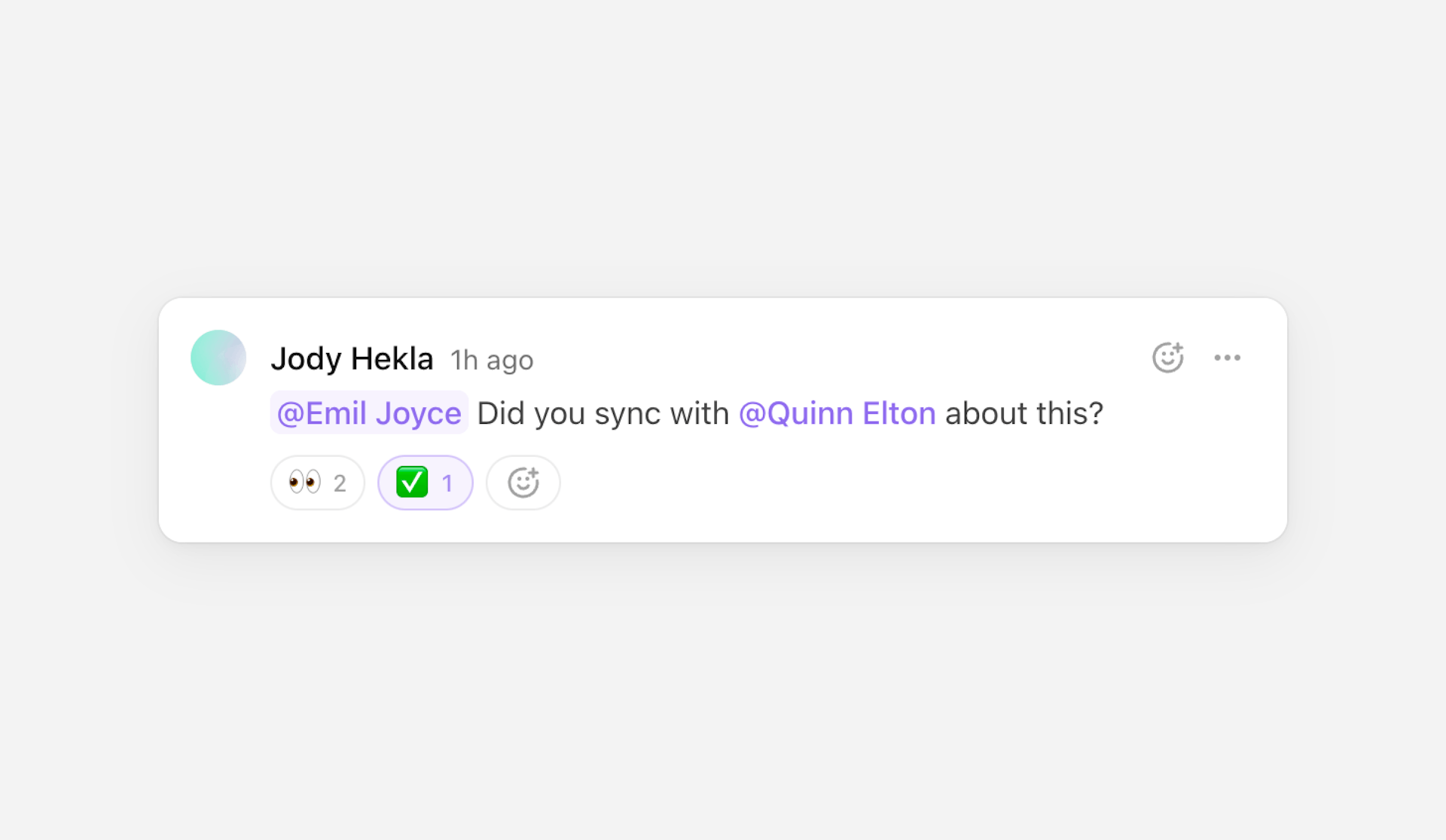
Comment
The Comment component renders a single comment. It’s useful if you’re
building a custom Thread component, or if you’re displaying a
standalone comment.
Usage
Start by importing the component, and passing the comment to it.
Customization
It’s possible to style and localize the default components:
- Import dark mode styles.
- Modify the style with CSS variables and class names.
- Use overrides to change default text used in the components.
Learn more under styling and customization.