@liveblocks/react-ui
@liveblocks/react-ui provides you with React components
to build collaborative experiences. Read our
Comments and
Notifications get started guides to learn
more.
AI Copilots
Default components
AiChat
Displays an interactive AI chat. AI can use knowledge and run actions or display content via tools.

Each chat is stored permanently, and is identified by its unique chatId. Chats
are only visible to the authenticated user who created
the chat.
Assigning a copilot
Use a custom copilot in your chat. You can define copilots with custom prompts &
settings in the Liveblocks dashboard, passing your API key from
OpenAI, Anthropic, or Google. Copy the copilot's ID and pass it to the
copilotId prop.
Dynamically switching copilots is possible, and messages will use whichever
copilotId is set when a message is sent.
Show placeholder content in new chats
In chats without messages, you can display placeholder content to welcome and
guide the user. To set this content, use the Empty property under
components.
Additionally, you can add suggestion buttons which will automatically submit new
messages to the chat when clicked. Create them with
useSendAiMessage.
List the user’s chats and switch between them
You can display a list of all chats created by the current user with
useAiChats. For example,
you can render a list of buttons that allow you to switch between chats. In each
button, you can display the chat’s automatically generated title, as seen below.
Chats can be deleted with
useDeleteAiChat.
Display the chat’s title
Each chat has a title property, automatically generated by AI. The title of a
new chat starts empty, and is updated after AI receives the first message and
writes a response. You can render this alongside your chat with
useAiChat.
Add front-end knowledge
You can add front-end knowledge to chats, meaning the AI will understand the information you pass, and will answer questions or call tools based on it. This is particularly helpful for passing user info, app state, and small contextual knowledge.
It’s generally recommended to use
RegisterAiKnowledge
for adding knowledge, as this will add knowledge to all AI features on the page.
However, if you’d like knowledge that is specific to one chat, you can add it
with the knowledge prop on AiChat. No other chats will have access to this
knowledge.
Add back-end knowledge
You can add back-end knowledge to chats, meaning the AI will understand the information you pass, and can answer questions or call tools based on it. This is a way to pass large amounts of project-wide information, for example complex documentation.
When creating or editing a copilot in the Liveblocks dashboard navigate to the Knowledge tab. Within here you can upload any relevant files, or submit websites for indexing. Your copilot will internalize this knowledge using retrieval-augmented generation (RAG).
Adjusting the chat’s width
When using the default inset layout, it’s possible to adjust the chat’s width
by setting the --lb-ai-chat-container-width CSS variable. This allows the
chat’s scroll window to stay full width, whilst keeping the composer and
messages centered in the middle.
Compact layout mode
An alternate compact layout mode is available, ideal for smaller UI components
such as pop-up windows. Compact layout mode removes the shadow and padding on
the composer, makes it full-width, and displays a border above it.
Change background color
You can change the background color of the chat by setting the --lb-background
CSS variable on .lb-ai-chat.
Customize CSS variables and classes
You can customize the default styles of the chat by modifying CSS variables and
classes prefixed with lb. Here are some examples.
Customize how Markdown is rendered
You can customize how Markdown is rendered in messages by passing components to
the components prop. A full list is available here.
Props
- chatIdstringRequired
The unique identifier for the chat. Each chat is stored permanently and is only visible to the authenticated user who created it.
- autoFocusboolean
Whether to automatically focus the composer input when the chat loads. Defaults to
false. - copilotIdstring
The ID of the custom copilot to use for this chat. Copy this from your copilot configuration in the Liveblocks dashboard.
- knowledgeAiKnowledgeSource[]
Array of knowledge sources specific to this chat. This knowledge will only be available to this chat instance and not to other AI features on the page.
- toolsRecord<string, AiToolDefinition>
Object mapping tool names to tool definitions that should be available in this chat.
- onComposerSubmitfunction
The event handler called when the composer is submitted.
- layout'inset' | 'compact'
The layout mode for the chat. Use
'inset'(default) for standalone chats, or'compact'for embedded scenarios like pop-up windows. - overridesAiChatOverrides
Advanced customization options for overriding default chat behavior and styling.
- componentsAiChatComponents
Custom components to override specific parts of the chat UI, such as the
Emptyplaceholder component or Markdown components. - responseTimeoutnumber
The time, in milliseconds, before an AI response will timeout. Defaults to 30_000.
- showReasoningboolean | 'during'
Whether to show reasoning. Defaults to
true. If set to'during', reasoning will only be shown during reasoning. - showRetrievalsboolean | 'during' | { ... } | undefined
Whether to show retrievals. Defaults to
true. If set to'during', retrievals will only be shown during retrieval. - showSourcesboolean
Whether to show sources. Defaults to
true. - classNamestring
CSS class name to apply to the chat container.
- styleCSSProperties
Inline styles to apply to the chat container. Useful for setting CSS custom properties.
components
Override specific parts of AiChat with custom components.
- Empty({ chatId: string, copilotId?: string }) => ReactNode
The component used to render the empty state of the chat. Defaults to nothing.
- Loading() => ReactNode
The component used to render the loading state of the chat. Defaults to a loading spinner.
- markdownPartial<MarkdownComponents>
The components used to render Markdown content.
- markdown.Paragraph({ children: ReactNode }) => ReactNode
The component used to render paragraphs.
- markdown.Inline
The component used to render inline elements (bold, italic, strikethrough, and inline code).
- markdown.Link({ href: string, title?: string, children: ReactNode }) => ReactNode
The component used to render links.
- markdown.Heading({ level: 1 | 2 | 3 | 4 | 5 | 6, children: ReactNode }) => ReactNode
The component used to render headings.
- markdown.Blockquote({ children: ReactNode }) => ReactNode
The component used to render blockquotes.
- markdown.CodeBlock({ code: string, language?: string }) => ReactNode
The component used to render code blocks.
- markdown.Image({ src: string, alt: string, title?: string }) => ReactNode
The component used to render images.
- markdown.List
The component used to render lists.
- markdown.Table
The component used to render tables.
- markdown.Separator() => ReactNode
The component used to render separators.
AiTool
Displays AI tool calls and their progress. Can be customized for many different UIs.
By default, AiTool will display the name of the current tool, and a loading
spinner as it runs.
Optionally, you can provide a title and icon to render the UI differently.
Props
- titleReactNode
The title to display for the tool. If not provided, the tool name will be formatted as a human-readable string.
- iconReactNode
Icon to display alongside the tool title. Can be an emoji string, React component, or any ReactNode.
- childrenReactNode
Content to display inside the tool container. Typically used for tool-specific UI or descriptions.
- variant'block' | 'minimal'
The visual appearance of the tool. The
"block"variant (default) displays the tool as a block with a border. - collapsedboolean
Whether the tool content should be collapsed. When collapsed, only the title and icon are visible.
- onCollapsedChange(collapsed: boolean) => void
Callback fired when the collapsed state changes. Use this to control the collapsed state externally.
- collapsibleboolean
Whether the tool content can be collapsed. If set to
false, clicking on it will have no effect. If there's no content, this prop has no effect. - classNamestring
CSS class name to apply to the tool container.
- styleCSSProperties
Inline styles to apply to the tool container.
All other HTML div props are also supported and will be passed through to the
underlying container element.
AiTool.Confirmation
Displays an AI tool with a confirmation UI. This allows you to create actions that users must confirm or cancel before they’re run.
Use the confirm and cancel props to define which actions should be taken
when the users clicks the buttons. You can return information that helps the AI
understand what has taken place, and data which you can use in render after
the tool is called.
AiTool.Confirmation will display different content depending on the stage of
the tool. For example, the confirm and cancel buttons will disappear when
clicked.
Props
- confirm(args: TArgs) => Promise<ToolResultResponse>Required
Function called when the user clicks the confirm button. It can return data which will be stored and accessible in
render, and optionally also a description for the AI to understand the result:{ data: { formId: 123 }, description: "The user accepted and submitted the form" } - cancel(args: TArgs) => Promise<ToolResultResponse>
Function called when the user clicks the cancel button.
- childrenReactNode
Content to display in the confirmation UI. Typically a question or description of the action being confirmed.
- variant'destructive' | 'default'
The visual appearance of the confirmation UI.
- overridesPartial<GlobalOverrides & AiToolConfirmationOverrides>
Override the component’s strings. It can be used the change the "confirm" and "cancel" labels.
All other HTML div props are also supported and will be passed through to the
underlying element.
AiTool.Inspector
Displays formatted view of the JSON arguments sent to and results returned by the AI during the current tool invocation. This is useful for debugging or for providing developers with insight into the data exchanged within your app.
To use, simply include <AiTool.Inspector /> inside an <AiTool /> component
to display the tool’s input arguments and resulting output.
Props
All HTML div props are supported and will be passed through to the underlying
element.
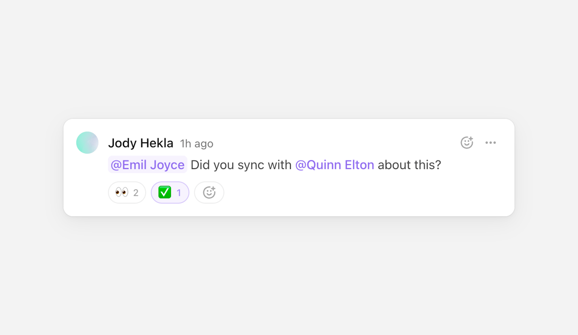
Comments
Default components
Thread
Displays a thread of comments. Each thread has a composer for creating replies.
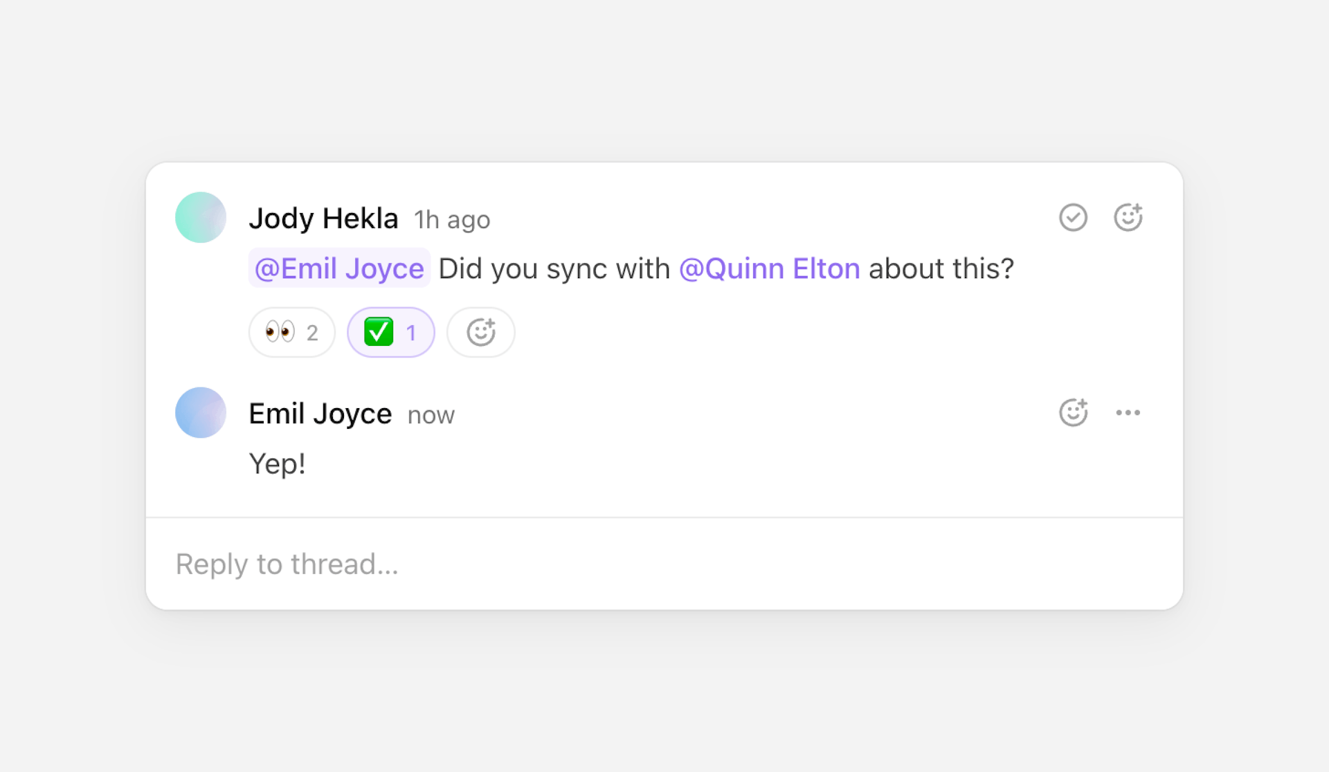
Map through threads to render a list of the room’s threads and comments.
Threads can be retrieved with
useThreads.
Resolved and unresolved threads
A thread can be marked as resolved or unresolved via its resolved property.
The Thread component automatically handles this through its resolved toggle
button displayed by default.
You can additionally use thread.resolved to filter the displayed threads for
example. Or if you want to create your own Thread component using
the primitives, you can use
useMarkThreadAsResolved
and
useMarkThreadAsUnresolved
to update the property.
Collapsed threads
You can collapse threads by setting the maxVisibleComments prop. If a thread
contains more comments than the limit set, some of the comments will be hidden
and a "Show more replies" button will be displayed instead. Clicking on it will
expand the thread to show all comments.
The first and last comments are always visible, and by default the oldest
comments are more likely to be hidden. You can customize this behavior by
setting maxVisibleComments to an object.
Customize comments
You can provide a custom Comment component via the components prop to fully
customize how comments are rendered within a thread. This allows you to render a
fully custom React component in the provided Comment slot, however it's often
preferable to insert the default
Comment component, and use
its customization options instead.
The children prop on Comment allows overriding or wrapping the comments’
content, while the additionalContent prop can be useful to render custom
content integrated into the comments’ content, just below the comment body. The
body prop is the same as the children prop but it only overrides the default
rich-text comment body while still keeping attachments, reactions, and
additionalContent as is.
Comment also offers avatar, author, and date props to allow overriding
or customizing the comment’s displayed avatar, author, and date respectively.
Comment.Avatar, Comment.Author, and Comment.Date can be used to retain the
default behavior and styles but with more control over them.
Rendering custom components
You can render fully custom components in comment threads, instead of showing
the default Comment component. This is particularly useful for inserting
custom UI into threads, such as data visualizations, tables,
custom AI commenting components, and
more.
Picture a thread that features a graph visualization instead of a comment. To
render it in the thread, you can create a comment and use its
comment metadata to define its
data. First, set up your metadata typing in your config file. We’ll define two
types of comments, a normal comment and a graph comment, and pass both to
CommentMetadata. Any data can go in here, but in this example, graphs are
defined with type: "graph" and a graphId.
Next, create the comment. This comment will most likely by created on the
server, using
liveblocks.createComment.
Set your graph’s metadata in the comment’s metadata option.
To render this graph inside a comment thread, check for the type: "graph"
value you defined in comment.metadata, and return a custom component instead
of a Comment. Make sure to return Comment for all regular comments.
If you’d like to render a custom component inside a comment UI, for example with avatar, author, date, then customize the comment component instead of returning a fully custom component.
Customize dropdown items
Thread shows a dropdown menu for threads and comments which contains actions
related to them: “Subscribe to thread”, “Edit comment”, “Delete comment”, etc.
The prop commentDropdownItems allows customizing the dropdown’s items, for
example adding new items. Items can be built with the Comment.DropdownItem
component which accepts an onSelect prop that is called when the item is
selected.
These new items will be displayed below the default items, but it’s possible to
change that by passing a function. This function receives a children prop
which contains the default items, so you can decide to display them above or
below your new items, or even not display them at all. This function also
receives a comment prop which contains the comment it’s attached to.
The Comment.DropdownItem component also accepts an icon prop to display an
icon next to the item’s label.
Comment offers the same as
Thread’s commentDropdownItems but named dropdownItems instead.
Props
- threadThreadDataRequired
The thread to display.
- showComposerboolean | "collapsed"Default is "collapsed"
How to show or hide the composer to reply to the thread.
- showActionsboolean | "hover"Default is "hover"
How to show or hide the actions.
- showReactionsbooleanDefault is true
Whether to show reactions.
- showAttachmentsbooleanDefault is true
Whether to show attachments.
- showComposerFormattingControlsbooleanDefault is true
Whether to show the composer’s formatting controls.
- blurComposerOnSubmitbooleanDefault is true
Whether to blur the composer editor when the composer is submitted.
- showResolveActionbooleanDefault is true
Whether to show the action to resolve the thread.
- maxVisibleCommentsnumber | objectDefault is No limit
The maximum number of comments to show.
- indentCommentContentbooleanDefault is true
Whether to indent the comments’ content.
- showDeletedCommentsbooleanDefault is false
Whether to show deleted comments.
- showSubscriptionbooleanDefault is true
Whether to show the thread’s subscription status.
- commentDropdownItemsReactNode | (props) => ReactNode
Add (or change) items to display in the comment’s dropdown.
- onComposerSubmitfunction
The event handler called when the composer is submitted.
- onResolvedChangefunction
The event handler called when changing the resolved status.
- onThreadDeletefunction
The event handler called when the thread is deleted. A thread is deleted when all its comments are deleted.
- onCommentEditfunction
The event handler called when a comment is edited.
- onCommentDeletefunction
The event handler called when a comment is deleted.
- onAuthorClickfunction
The event handler called when clicking on a comment’s author.
- onMentionClickfunction
The event handler called when clicking on a mention.
- onAttachmentClickfunction
The event handler called when clicking on a comment’s attachment.
- overridesPartial<GlobalOverrides & ThreadOverrides & CommentOverrides & ComposerOverrides>
Override the component’s strings.
- componentsPartial<GlobalComponents & ThreadComponents>
Override the component’s components.
components
Override the component’s components, including providing a custom Comment
component.
- CommentComponentType<CommentProps>
The component used to display comments.
FloatingThread
Displays a floating thread attached to a trigger element.

FloatingThread can be combined with CommentPin in canvas-like
UIs.

Props
In addition to all Thread props:
- childrenReactNodeRequired
The element which opens the floating thread.
- defaultOpenboolean
Whether the floating thread is initially open.
- openboolean
Whether the floating thread is currently open.
- onOpenChangefunction
The event handler called when the open state changes.
- side"top" | "right" | "bottom" | "left"Default is "right"
The preferred side of the trigger to render the floating thread on.
- sideOffsetnumberDefault is 6
The side offset in pixels from the trigger.
- align"start" | "center" | "end"Default is "start"
How the floating thread is aligned against its trigger.
- alignOffsetnumber
The alignment offset in pixels.
Composer
Displays a composer for creating threads or comments.
By default, submitting the composer will create a new thread.
Adding thread metadata
If you’d like to attach custom metadata to the newly created thread, you can add
a metadata prop.
Typed metadata
You can use TypeScript to type your custom metadata by editing your config file.
Metadata properties can be string, number, or boolean.
Creating private threads
Threads are public by default. If you’d like the composer to create private
threads, you can add a visibility prop.
Permissions are taken into account when threads are created and retrieved. A
user without write access to private threads can’t create a private thread, and
users without read access to private threads won’t receive private threads from
useThreads.
Private threads are only available on Team and Enterprise plans.
Replying to a thread
If you provide a threadId, then submitting the composer will add a new reply
to the thread.
Adding comment metadata
If you’d like to attach custom metadata to a reply, you can add a
commentMetadata prop. This prop is typed as CommentMetadata.
Modifying a comment
If you provide both a threadId and a commentId, then submitting the composer
will edit the comment.
Custom behavior
If you’d like to customize submission behavior, you can use
event.preventDefault() in onComposerSubmit to disable the default behavior
and call comment and thread mutation methods manually.
Learn more about mutation hooks under
@liveblocks/react.
Props
- threadIdstring
The ID of the thread to reply to or to edit a comment in.
- commentIdstring
The ID of the comment to edit.
- metadataThreadMetadata
The metadata of the thread to create.
- visibility"public" | "private"Default is "public"
Whether to create a public or private thread. Only applies when creating a new thread, and requires write access to the selected visibility.
- commentMetadataCommentMetadata | Partial<CommentMetadata>
The metadata of the comment to create or edit.
- onComposerSubmitfunction
The event handler called when the composer is submitted.
- blurOnSubmitbooleanDefault is true
Whether to blur the composer editor when the composer is submitted.
- defaultValueCommentBody
The composer’s initial value.
- defaultAttachmentsCommentAttachment[]
The composer’s initial attachments.
- collapsedboolean
Whether the composer is collapsed. Setting a value will make the composer controlled.
- onCollapsedChangefunction
The event handler called when the collapsed state of the composer changes.
- showAttachmentsbooleanDefault is true
Whether to show and allow adding attachments.
- showFormattingControlsbooleanDefault is true
Whether to show formatting controls (e.g. a floating toolbar with formatting toggles when selecting text)
- defaultCollapsedboolean
Whether the composer is initially collapsed. Setting a value will make the composer uncontrolled.
- disabledboolean
Whether the composer is disabled.
- autoFocusboolean
Whether to focus the composer on mount.
- overridesPartial<GlobalOverrides & ComposerOverrides>
Override the component’s strings.
FloatingComposer
Displays a floating composer attached to a trigger element.

Use metadata to attach context to the thread when submitting (for example
canvas coordinates or table cell IDs).
FloatingComposer can be combined with CommentPin in
canvas-like UIs.

Props
In addition to all Composer props (except collapsed,
onCollapsedChange, and defaultCollapsed):
- childrenReactNodeRequired
The element which opens the floating composer.
- defaultOpenboolean
Whether the floating composer is initially open.
- openboolean
Whether the floating composer is currently open.
- onOpenChangefunction
The event handler called when the open state changes.
- side"top" | "right" | "bottom" | "left"Default is "right"
The preferred side of the trigger to render the floating composer on.
- sideOffsetnumberDefault is 6
The side offset in pixels from the trigger.
- align"start" | "center" | "end"Default is "start"
How the floating composer is aligned against its trigger.
- alignOffsetnumber
The alignment offset in pixels.
Comment
Displays a single comment.
Map through thread.comments to render each comment in a thread. Threads can be
retrieved with useThreads.
Custom thread components
Comment can be used in combination with Composer to
create a custom thread component. The composer in this example is used to
reply to the existing thread.
Props
- commentCommentDataRequired
The comment to display.
- avatarReactNode
The comment’s avatar. Can be combined with
Comment.Avatarto easily follow default styles. - authorReactNode
The comment’s author. Can be combined with
Comment.Authorto easily follow default styles. - dateReactNode
The comment’s date. Can be combined with
Comment.Dateto easily follow default styles, or theTimestampprimitive for more control. - showActionsboolean | "hover"Default is "hover"
How to show or hide the actions.
- showReactionsbooleanDefault is true
Whether to show reactions.
- showAttachmentsbooleanDefault is true
Whether to show attachments.
- showComposerFormattingControlsbooleanDefault is true
Whether to show the composer’s formatting controls when editing the comment.
- indentContentbooleanDefault is true
Whether to indent the comment’s content.
- additionalContentReactNode
Additional content to display below the comment’s body.
- bodyReactNode | (props) => ReactNode
Override only the comment’s rich-text body. Receives the comment data and the default content as children.
- showDeletedbooleanDefault is false
Whether to show the comment if it was deleted. If set to
false, it will render deleted comments asnull. - dropdownItemsReactNode | (props) => ReactNode
Add (or change) items to display in the comment’s dropdown.
- childrenReactNode | (props) => ReactNode
Override the comment’s content. Receives the comment data and the default content as children.
- onCommentEditfunction
The event handler called when the comment is edited.
- onCommentDeletefunction
The event handler called when the comment is deleted.
- onAuthorClickfunction
The event handler called when clicking on the author.
- onMentionClickfunction
The event handler called when clicking on a mention.
- onAttachmentClickfunction
The event handler called when clicking on a comment’s attachment.
- overridesPartial<GlobalOverrides & CommentOverrides & ComposerOverrides>
Override the component’s strings.
Comment.Avatar
Displays a comment’s avatar. Use this within the avatar prop to follow default
styles while customizing the avatar.
Props
- userIdstringRequired
The user ID to display the avatar for.
Comment.Author
Displays a comment’s author. Use this within the author prop to follow default
styles while customizing the author.
Props
- userIdstringRequired
The user ID to display the author for.
Comment.DropdownItem
Displays a dropdown item in the comment’s dropdown menu. Use this within the
dropdownItems prop to add custom actions.
Props
- iconReactNode
An optional icon displayed in this dropdown item.
- onSelectfunction
The event handler called when the dropdown item is selected.
CommentPin
Displays a comment pin that can be used as a trigger for FloatingComposer and
FloatingThread, or anywhere else in your UI.

Set the userId prop to display an avatar inside the pin, for example to
represent the thread’s author.
Use the corner prop to choose which corner the pin points to, it will move
itself to always point to wherever it is positioned.
You can either use the size prop or override --lb-comment-pin-size with CSS
to change the pin’s size.
Pass children to display custom content inside the pin. When children are
provided, the userId prop is ignored.
Props
- corner"top-left" | "top-right" | "bottom-right" | "bottom-left"Default is "bottom-left"
The corner that points to the comment position.
- userIdstring
The user ID to optionally display an avatar for. Ignored if
childrenis provided. - sizestring | number
The size of the pin.
- paddingstring | number
The padding within the pin.
- childrenReactNode
The content shown in the pin. If provided, the
userIdprop is ignored.
Primitives
Primitives are unstyled, headless components that can be used to create fully custom commenting experiences. We have a primitives example highlighting how to use them.
If you run into the
Cannot find module '@liveblocks/react-ui/primitives' or its corresponding type declarations
error, you should update your tsconfig.json’s moduleResolution
property to
"node16" or "nodenext" (or "bundler" if you’re on TS >=5).
Composition
All primitives are composable; they forward their props and refs, merge their classes and styles, and chain their event handlers.
Inspired by Radix (and powered by its
Slot utility), most
of the primitives also support an asChild prop to replace the rendered element
by any provided child, and both set of props will be merged.
Learn more about this concept on Radix’s composition guide.
Composer
Used to render a composer for creating, or editing, threads and comments.
Combine with
useCreateThread to
render a composer that creates threads.
Composer.Form
Surrounds the composer’s content and handles submissions. By default, no action
occurs when the composer is submitted. You must create your own mutations within
onComposerSubmit for
creating threads,
creating comments,
editing comments, etc.
- defaultAttachmentsCommentAttachment[]
The composer’s initial attachments.
- pasteFilesAsAttachmentsbooleanDefault is false
Whether to create attachments when pasting files into the editor.
- preventUnsavedChangesbooleanDefault is true
When
preventUnsavedChangesis set on your Liveblocks client onLiveblocksProvider, then closing a browser tab will be prevented when there are unsaved changes. By default, that will include draft text or attachments that are being uploaded via this composer, but not submitted yet. If you want to prevent unsaved changes with Liveblocks, but not for this composer, you can opt-out this composer instance by setting this prop tofalse. - blurOnSubmitbooleanDefault is true
Whether to blur the editor when the form is submitted.
- onComposerSubmitfunction
The event handler called when the form is submitted.
- disabledbooleanDefault is false
Whether the composer is disabled.
- asChildbooleanDefault is false
Replace the rendered element by the one passed as a child.
Composer.Editor
Displays the composer’s editor.
- defaultValueCommentBody
The editor’s initial value.
- placeholderstring
The text to display when the editor is empty.
- disabledboolean
Whether the editor is disabled.
- autoFocusboolean
Whether to focus the editor on mount.
- dir"ltr" | "rtl"
The reading direction of the editor and related elements.
- componentsPartial<ComposerEditorComponents>
The components displayed within the editor.
| Attribute | Value |
|---|---|
data-focused | Present when the component is focused. |
data-disabled | Present when the component is disabled. |
components
The components displayed within the editor.
- MentionComponentType<ComposerEditorMentionProps>
The component used to display mentions. Defaults to the mention’s
idprefixed by an @. - MentionSuggestionsComponentType<ComposerEditorMentionSuggestionProps>
The component used to display mention suggestions. Defaults to a list of the suggested mentions’
id. - LinkComponentType<ComposerEditorLinkProps>
The component used to display links. Defaults to the link’s
childrenproperty. - FloatingToolbarComponentType<ComposerEditorFloatingToolbarProps>
The component used to display a floating toolbar attached to the selection.
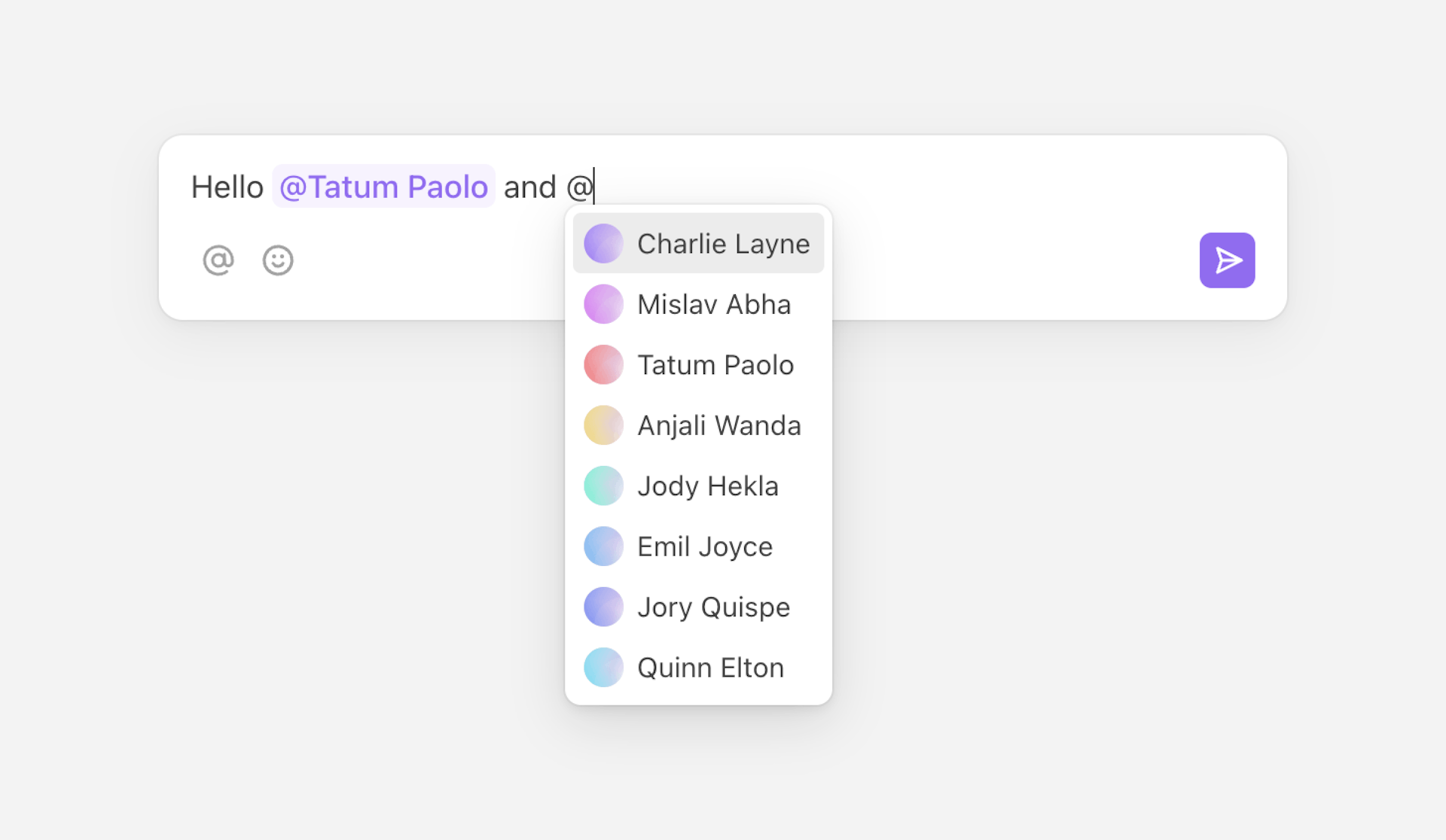
Mention
The component used to display mentions.
- mentionMentionData
The mention to display.
- isSelectedboolean
Whether the mention is selected.
MentionSuggestions
The component used to display mention suggestions.
- mentionsMentionData[]
The list of suggested mentions.
- selectedMentionIdstring
The currently selected mention’s ID.
Link
The component used to display links.
- hrefstring
The link’s absolute URL.
- childrenReactNode
The link’s content.
FloatingToolbar
Displays a floating toolbar attached to the selection within Composer.Editor.
Composer.Mention
Displays mentions within Composer.Editor.
- asChildbooleanDefault is false
Replace the rendered element by the one passed as a child.
| Attribute | Value |
|---|---|
data-selected | Present when the mention is selected. |
Composer.Suggestions
Contains suggestions within Composer.Editor.
- asChildbooleanDefault is false
Replace the rendered element by the one passed as a child.
Composer.SuggestionsList
Displays a list of suggestions within Composer.Editor.
- asChildbooleanDefault is false
Replace the rendered element by the one passed as a child.
Composer.SuggestionsListItem
Displays a suggestion within Composer.SuggestionsList.
- valuestringRequired
The suggestion’s value.
- asChildbooleanDefault is false
Replace the rendered element by the one passed as a child.
| Attribute | Value |
|---|---|
data-selected | Present when the item is selected. |
Composer.Link
Displays links within Composer.Editor.
- asChildbooleanDefault is false
Replace the rendered element by the one passed as a child.
Composer.Submit
A button to submit the composer.
- asChildbooleanDefault is false
Replace the rendered element by the one passed as a child.
Composer.FloatingToolbar
Displays a floating toolbar attached to the selection within Composer.Editor.
- asChildbooleanDefault is false
Replace the rendered element by the one passed as a child.
Composer.MarkToggle
A toggle button which toggles a specific text mark.
- markComposerBodyMarkRequired
The text mark to toggle.
- onValueChangefunction
The event handler called when the mark is toggled.
- asChildbooleanDefault is false
Replace the rendered element by the one passed as a child.
Composer.AttachFiles
A button which opens a file picker to create attachments.
- asChildbooleanDefault is false
Replace the rendered element by the one passed as a child.
Composer.AttachmentsDropArea
A drop area which accepts files to create attachments.
- asChildbooleanDefault is false
Replace the rendered element by the one passed as a child.
Comment
Used to render a single comment.
Map through thread.comments to render each comment in a thread. Threads can be
retrieved with useThreads.
Comment.Body
Displays a comment body.
- bodyCommentBody
The comment body to display. If not defined, the component will render
null. - componentsPartial<CommentBodyComponents>
The components displayed within the comment body.
- asChildbooleanDefault is false
Replace the rendered element by the one passed as a child.
components
The components displayed within the comment body.
- MentionComponentType<CommentBodyMentionProps>
The component used to display mentions. Defaults to the mention’s
idprefixed by an @. - LinkComponentType<CommentBodyLinkProps>
The component used to display links. Defaults to the link’s
childrenproperty.
Mention
The component used to display mentions.
- mentionMentionData
The mention to display.
Link
The component used to display links.
- hrefstring
The link’s absolute URL.
- childrenReactNode
The link’s content.
Comment.Mention
Displays mentions within Comment.Body.
- asChildbooleanDefault is false
Replace the rendered element by the one passed as a child.
Comment.Link
Displays links within Comment.Body.
- asChildbooleanDefault is false
Replace the rendered element by the one passed as a child.
Timestamp
Displays a formatted date, and automatically re-renders to support relative formatting. Defaults to relative formatting for nearby dates (e.g. “5 minutes ago” or "in 1 day") and a short absolute formatting for more distant ones (e.g. “25 Aug”).
Use with comment.createdAt, comment.editedAt, or comment.deletedAt to
display a human-readable time.
- dateDate | string | numberRequired
The date to display.
- childrenfunction
A function to format the displayed date. Defaults to a relative date formatting function.
- titlestring | function
The
titleattribute’s value or a function to format it. Defaults to an absolute date formatting function. - intervalnumber | falseDefault is 30000
The interval in milliseconds at which the component will re-render. Can be set to
falseto disable re-rendering. - localestring
The locale used when formatting the date. Defaults to the browser’s locale.
- asChildbooleanDefault is false
Replace the rendered element by the one passed as a child.
Duration
Displays a formatted duration, and automatically re-renders to if the duration is in progress. Defaults to a short format (e.g. “5s” or “1m 40s”).
Instead of providing a duration in milliseconds, you can also provide start and
end dates for the duration via the from and to props. If only from is
provided it means that the duration is in progress, and the component will
re-render at an interval, customizable with the interval prop.
- durationnumber
The duration in milliseconds. If provided,
fromandtowill be ignored. - fromDate | string | number
The date at which the duration starts. If provided,
durationwill be ignored. If provided withouttoit means that the duration is in progress, and the component will re-render at an interval, customizable with theintervalprop. - toDate | string | number
The date at which the duration ends. If
fromis provided withoutto,Date.now()will be used. - childrenfunction
A function to format the displayed date. Defaults to a short duration formatting function.
- titlestring | function
The
titleattribute’s value or a function to format it. Defaults to an longer duration formatting function. - intervalnumber | falseDefault is 500
The interval in milliseconds at which the component will re-render if
fromis provided withoutto, meaning that the duration is in progress. Can be set tofalseto disable re-rendering. - localestring
The locale used when formatting the duration. Defaults to the browser’s locale.
- asChildbooleanDefault is false
Replace the rendered element by the one passed as a child.
FileSize
Displays a formatted file size.
Use with attachment.size to display a human-readable file size.
- sizenumberRequired
The file size to display.
- childrenfunction
A function to format the displayed file size. Defaults to a human-readable file size formatting function.
- localestring
The locale used when formatting the file size. Defaults to the browser’s locale.
- asChildbooleanDefault is false
Replace the rendered element by the one passed as a child.
Emoji picker
Using Frimousse alongside
useAddReaction, a
package originally designed for Comments, you can easily add an emoji picker to
your primitive Comments components.
Find a full code snippet of this in our Comments primitives example.
Emoji reactions
A list of clickable emoji reactions can be created using the
useAddReaction,
useRemoveReaction,
and useSelf hooks.
Hooks
useComposer
Returns states and methods related to the composer. Can only be used within the
Composer.Form primitive.
All values listed below.
Custom composer behavior
useComposer can be used in combination with
Composer primitives to create a custom composer, and
control its behavior. For example, createMention allows you to create a button
which focuses the editor, adds @, and opens the mention suggestions dropdown.
Handle attachments
When using primitives,
Composer.AttachFiles and
Composer.AttachmentsDropArea add
attachments to the composer, but they’re not rendered without useComposer. The
attachments array can be used to render the current attachments, and
removeAttachment allows you to remove them.
Values
- isDisabledboolean
Whether the composer is currently disabled.
- isFocusedboolean
Whether the editor is currently focused.
- isEmptyboolean
Whether the editor is currently empty.
- canSubmitboolean
Whether the composer can currently be submitted.
- submitfunction
Submit the editor programmatically.
- clearfunction
Clear the editor programmatically.
- selectfunction
Select the editor programmatically.
- focusfunction
Focus the editor programmatically.
- blurfunction
Blur the editor programmatically.
- marksComposerBodyMarks
Which text marks are currently active and which aren’t.
- toggleMarkfunction
Toggle a specific text mark.
- createMentionfunction
Start creating a mention at the current selection.
- insertTextfunction
Insert text at the current selection.
- attachFilesfunction
Open a file picker programmatically to create attachments.
- attachmentsComposerAttachment[]
The composer’s current attachments.
- removeAttachmentfunction
Remove an attachment by its ID.
Other hooks
Other Comments hooks are part of
@liveblocks/react, you can find them
on the
React API reference page.
useThreadsuseThreadSubscriptionuseCreateThreaduseDeleteThreaduseEditThreadMetadatauseMarkThreadAsResolveduseMarkThreadAsUnresolveduseMarkThreadAsReaduseCreateCommentuseEditCommentuseEditCommentMetadatauseDeleteCommentuseAddReactionuseRemoveReactionuseAttachmentUrl
Notifications
Default components
InboxNotification
Displays a single inbox notification.

Map through inboxNotifications with
useInboxNotifications
to render a list of the room’s notifications.
Rendering notification kinds differently
Different kinds of notifications are available, for example thread which is
triggered when using Comments, or $myCustomNotification which would be a
custom notification you’ve triggered manually. You can choose to render each
notification differently.
Adding these two properties to kinds will overwrite the default component
that’s displayed for those two notification types. Using
InboxNotification.Thread
and
InboxNotification.Custom
in this way allow you to easily create components that fit into the existing
design system, whilst still adding lots of customization. However, it’s also
valid to render any custom JSX.
Typing custom notifications
To type custom notifications, edit the ActivitiesData type in your config
file.
Your activities data is now correctly typed in inline functions.
If you’d like to create a typed function elsewhere, you can use
InboxNotificationCustomProps with a generic. In the example below we’re using
the $alert notification kind as a generic,
InboxNotificationCustomKindProps<"$alert">.
Batching custom notifications
If you’re batching custom notifications, you can render each activity inside a single notification.
Props
- inboxNotificationInboxNotificationDataRequired
The inbox notification to display.
- hrefstring
The URL which the inbox notification links to.
- showActionsboolean | "hover"
How to show or hide the actions.
- kindsPartial<InboxNotificationKinds>
Override specific kinds of inbox notifications.
- overridesPartial<GlobalOverrides & InboxNotificationOverrides & CommentOverrides>
Override the component’s strings.
- componentsPartial<GlobalComponents>
Override the component’s components.
kinds
Override specific kinds of inbox notifications.
- threadComponentType<InboxNotificationThreadKindProps>
The component used to display thread notifications. Defaults to
InboxNotification.Thread. - textMentionComponentType<InboxNotificationTextMentionKindProps>
The component used to display text mention notifications. Defaults to
InboxNotification.TextMention. - $${string}ComponentType<InboxNotificationCustomKindProps>
The component used to display a custom notification kind. Custom notification kinds must start with a
$.
InboxNotification.Thread
Displays a thread inbox notification kind.
- inboxNotificationInboxNotificationThreadDataRequired
The inbox notification to display.
- showActionsboolean | "hover"
How to show or hide the actions.
- showRoomNamebooleanDefault is true
Whether to show the room name in the title.
- showReactionsbooleanDefault is true
Whether to show reactions.
- showAttachmentsbooleanDefault is true
Whether to show attachments.
InboxNotification.TextMention
Displays a text mention inbox notification kind.
- inboxNotificationInboxNotificationTextMentionDataRequired
The inbox notification to display.
- showActionsboolean | "hover"
How to show or hide the actions.
- showRoomNamebooleanDefault is true
Whether to show the room name in the title.
InboxNotification.Custom
Displays a custom notification kind.
- inboxNotificationInboxNotificationCustomDataRequired
The inbox notification to display.
- titleReactNodeRequired
The inbox notification’s title.
- childrenReactNodeRequired
The inbox notification’s content.
- showActionsboolean | "hover"
How to show or hide the actions.
- asideReactNode
The inbox notification’s aside content. Can be combined with
InboxNotification.IconorInboxNotification.Avatarto easily follow default styles. - asChildbooleanDefault is false
Replace the rendered element by the one passed as a child.
InboxNotification.Inspector
Displays the inbox notification’s data in a JSON code snippet. Useful when debugging notifications in your app.
- inboxNotificationInboxNotificationDataRequired
The inbox notification to display.
- showActionsboolean | "hover"
How to show or hide the actions.
InboxNotificationList
Displays inbox notifications as a list. Each
InboxNotification component will be wrapped in a li
element.

Props
- childrenReactNode
The inbox notifications to display.
Hooks
All hooks for Notifications are in
@liveblocks/react.
Presence
Default components
Avatar
Displays a user avatar from an image URL, or falls back to initials.
You can also customize fallback content by passing children. This will take precedence over the default content.
Use outline to add an outline around the avatar.
Use tooltip to display additional content on hover.
Props
- srcstring
The URL of the avatar’s image.
- namestring
The name of the avatar.
- outlineboolean | string | { ... }
Whether and how the avatar should have an outline.
- tooltipReactNode
The content to display in the avatar’s tooltip.
- childrenReactNode
Override the avatar’s content.
AvatarStack
Displays a stack of avatars for users currently present in the room.

You can include additional users (e.g. users who are invited to the room but not
currently present) and control how many avatars are shown before grouping the
rest as +N.
User IDs (both from Presence and the userIds prop) are deduplicated so the
same user present with multiple tabs for example will only be displayed once in
the stack.
You can either use the size prop or override --lb-avatar-stack-size with CSS
to change the avatars’ size.
You can use the variant prop to switch between default and outlined avatars.
The outline color uses the resolved user’s color property by default.
User information
AvatarStack uses
resolveUsers
to resolve each user’s information and then uses the name and avatar
properties.
Props
- userIdsstring[]
Optional additional user IDs to include in the stack.
- maxnumber | nullDefault is 3
The maximum number of items in the stack (at least 2). Set to
nullto show all avatars. - sizestring | number
The size of the avatars.
- gapstring | number
The gap around the avatars.
- variant"default" | "outline"Default is "default"
Whether the avatars should show an outline.
- overridesPartial<GlobalOverrides>
Override the component’s strings.
Cursors
Displays multiplayer cursors for other users in the room while tracking your own pointer position.
It works out-of-the-box with best practices built-in:
- Cursors are positioned relative to the container’s size
- Their coordinates are percentage-based instead of absolute pixels
- Cursors are interpolated with springs to smooth their movement
- Learn more about this in our article about animating multiplayer cursors
- Performance bottlenecks like re-renders or
position: absolutelayout thrashing are avoided

By default, cursor coordinates are stored in Presence under "cursor". Use
presenceKey to render multiple Cursors areas in a single room.
If you need more control, you can use the single Cursor component
and handle positioning manually with the Presence hooks in
@liveblocks/react.
User information
Cursors uses
resolveUsers
to resolve each user’s information and then uses the name and color
properties.
Customize cursors
Pass a Cursor component through the components prop to control how each
cursor is rendered. It receives userId and connectionId via its props. Its
position and visibility are still handled by Cursors.
Props
- presenceKeystringDefault is "cursor"
The key used to store cursor coordinates in users’ Presence.
- componentsPartial<GlobalComponents & CursorsComponents>
Override the component’s components.
Cursor
Displays a multiplayer cursor with a color and an optional label.

You can either use the color prop or override --lb-cursor-color with CSS to
change the cursor’s color, by default it’s set to --lb-accent. The label’s
text color is dynamically set to contrast with the cursor’s color automatically.
It’s sized as 0×0px to make it easy to position it either via transform or
top/left.
Props
- colorstring
The color of the cursor.
- labelReactNode
A floating label to display next to the cursor.
Hooks
All hooks for Presence are in
@liveblocks/react.
Version History
Version history enables you to track and restore versions of your Storage and Yjs documents. These ready-made components aid in displaying a list of version information for Tiptap, BlockNote, and Lexical. Learn how to set this up in our version history guide.
Default components
HistoryVersionSummary
Displays a version summary which includes the author and date.
Props
- onClick() => void
The function to call when the version summary is clicked.
- versionVersion
The version object containing information about the specific version.
- selectedboolean
Whether this version is currently selected.
HistoryVersionSummaryList
Displays a list of version summaries for a document’s history including authors and dates.
Props
- childrenReactNode
The version summaries to display, typically an array of HistoryVersionSummary components.
Utilities
Components
Icon
Most icons used in the default components can be exported via <Icon.* />.
They’re stroke-based and designed for use at 20×20 pixels.
Find a full list of available icons in our GitHub repo.
LiveblocksUiConfig
Set configuration options for all @liveblocks/react-ui components, such as
overrides.
Props
- overridesPartial<Overrides>
Override the components’ strings.
- componentsPartial<Components>
Override the components’ components.
- portalContainerHTMLElementDefault is document.body
The container to render the portal into.
- preventUnsavedComposerChangesbooleanDefault is true
When
preventUnsavedChangesis set on your Liveblocks client (or set onLiveblocksProvider), then closing a browser tab will be prevented when there are unsaved changes. By default, that will include draft texts or attachments that are (being) uploaded via comments/threads composers, but not submitted yet. If you want to prevent unsaved changes with Liveblocks, but not for composers, you can opt-out by setting this option tofalse. - emojibaseUrlstringDefault is "https://cdn.jsdelivr.net/npm/emojibase-data"
Use this option to host your own emoji data.
The Liveblocks emoji picker (visible when adding reactions in
Comment) is built with Frimousse, which fetches its data from Emojibase.This option allows you to change the base URL of where the
emojibase-datafiles should be fetched from, used as follows:${emojibaseUrl}/${locale}/${file}.json. (e.g.${emojibaseUrl}/en/data.json).
Hooks
All hooks for Version History are in
@liveblocks/react.
Styling and customization
Default styles
The default components come with default styles. These styles can be imported
into the root of your app or directly into a CSS file with @import.
Dark mode
You can also import default dark mode styling. There are two versions to choose from, the first uses the system theme.
The second uses the dark class name, and two commonly used data attributes.
CSS variables
The default components are built around a set of customizable CSS variables. Set
these variables within .lb-root to globally style your components.
- --lb-radiusDefault is 0.5em
The border radius scale.
emvalues recommended. - --lb-spacingDefault is 1em
The spacing scale.
emvalues recommended. - --lb-accentDefault is #1177ff
The accent color.
- --lb-accent-foregroundDefault is #ffffff
The foreground color used over the accent color.
- --lb-destructiveDefault is #ff4455
The destructive color.
- --lb-destructive-foregroundDefault is #ffffff
The foreground color used over the destructive color.
- --lb-backgroundDefault is #ffffff
The main background color.
- --lb-foregroundDefault is #111111
The main foreground color.
- --lb-line-heightDefault is 1.5
The line height of main elements (e.g. comment bodies).
- --lb-icon-sizeDefault is 20px
The size of icons.
- --lb-icon-weightDefault is 1.5px
The stroke weight of icons.
- --lb-avatar-radiusDefault is 50%
The border radius used for avatars.
- --lb-button-radiusDefault is calc(0.75 * var(--lb-radius))
The border radius used for buttons.
- --lb-transition-durationDefault is 0.1s
The duration used for transitioned elements.
- --lb-transition-easingDefault is cubic-bezier(0.4, 0, 0.2, 1)
The easing function used for transitioned elements.
- --lb-elevation-shadowDefault is 0 0 0 1px rgb(0 0 0 / 4%), 0 2px 6px rgb(0 0 0 / 8%), 0 8px 26px rgb(0 0 0 / 12%)
The box shadow added to elevated elements.
- --lb-elevation-shadow-moderateDefault is 0 0 0 1px rgb(0 0 0 / 4%), 0 2px 6px rgb(0 0 0 / 6%), 0 8px 26px rgb(0 0 0 / 8%)
The box shadow added to moderately elevated elements.
- --lb-tooltip-shadowDefault is 0 2px 4px rgb(0 0 0 / 8%), 0 4px 12px rgb(0 0 0 / 12%)
The box shadow added to tooltips.
- --lb-accent-contrastDefault is 8%
Affects the lightness of accent colors.
%value required. - --lb-destructive-contrastDefault is 8%
Affects the lightness of destructive colors.
%value required. - --lb-foreground-contrastDefault is 6%
Affects the lightness of foreground colors.
%value required.
Class names
Each default component has a set of predefined class names, which can be helpful for custom styling, for example.
Additionally, some elements also have data attributes to provide contextual information, for example:
Classes containing colons : are internal and may change over time.
Portaled elements
Floating elements within the default components (e.g. tooltips, dropdowns, etc)
are portaled to the end of the document to avoid z-index conflicts and
overflow issues.
When portaled, those elements are also wrapped in a container to handle their
positioning. These containers don’t have any specific class names or data
attributes so they shouldn’t be targeted or styled directly, but they will
mirror whichever z-index value is set on their inner element (which would be
auto by default). So if you need to set a specific z-index value on floating
elements, you should set it on the floating elements themselves directly,
ignoring their containers. You can either target specific floating elements
(e.g. .lb-tooltip, .lb-dropdown, etc) or all of them at once via the
.lb-portal class name.
Overrides
Overrides can be used to customize components’ strings and localization-related properties, such as locale and reading direction.
They can be set globally for all components using LiveblocksUiConfig:
Overrides can also be set per-component, and these settings will take precedence
over global settings. This is particularly useful in certain contexts, for
example when you’re using a <Composer /> component for creating replies to
threads:
Override names
Here's a list of all available override names, their descriptions, and default values.
Localization
Localization overrides can only be set on
LiveblocksUiConfig.
| Name | Description | Default value |
|---|---|---|
locale | Locale code | "en" |
dir | Text direction | "ltr" |
Global
Global overrides can only be set on
LiveblocksUiConfig.
| Name | Description | Default value |
|---|---|---|
USER_SELF | Current user label | "you" |
USER_UNKNOWN | Unknown user label | "Anonymous" |
LIST_REMAINING | Remaining items | "X more" |
LIST_REMAINING_USERS | Remaining users | "X others" |
LIST_REMAINING_COMMENTS | Remaining comments | "X more comments" |
EMOJI_PICKER_SEARCH_PLACEHOLDER | Emoji search placeholder | "Search…" |
EMOJI_PICKER_EMPTY | Empty emoji results | "No emoji found." |
EMOJI_PICKER_ERROR | Emoji picker error | "There was an error…" |
EMOJI_PICKER_CHANGE_SKIN_TONE | Skin tone button label | "Change skin tone" |
ATTACHMENT_TOO_LARGE | File too large error | "The file is larger than X" |
ATTACHMENT_ERROR | Upload error | "The file couldn't be uploaded." |
COPY_TO_CLIPBOARD | Copy button label | "Copy" |
Composer
Composer overrides can be set on both
Composer and
LiveblocksUiConfig.
| Name | Description | Default value |
|---|---|---|
COMPOSER_INSERT_MENTION | Mention button label | "Mention someone" |
COMPOSER_INSERT_EMOJI | Emoji button label | "Add emoji" |
COMPOSER_ATTACH_FILES | Attach button label | "Attach files" |
COMPOSER_REMOVE_ATTACHMENT | Remove attachment label | "Remove attachment" |
COMPOSER_PLACEHOLDER | Input placeholder | "Write a comment…" |
COMPOSER_SEND | Send button label | "Send" |
COMPOSER_TOGGLE_MARK | Format toggle labels | "Bold", "Italic", etc. |
Comment
Comment overrides can be set on both
Comment and
LiveblocksUiConfig.
| Name | Description | Default value |
|---|---|---|
COMMENT_EDITED | Edited indicator | "(edited)" |
COMMENT_DELETED | Deleted message | "This comment has been deleted." |
COMMENT_MORE | More actions label | "More" |
COMMENT_EDIT | Edit action label | "Edit comment" |
COMMENT_EDIT_COMPOSER_PLACEHOLDER | Edit placeholder | "Edit comment…" |
COMMENT_EDIT_COMPOSER_CANCEL | Cancel edit label | "Cancel" |
COMMENT_EDIT_COMPOSER_SAVE | Save edit label | "Save" |
COMMENT_DELETE | Delete action label | "Delete comment" |
COMMENT_DELETE_ATTACHMENT | Delete attachment label | "Delete attachment" |
COMMENT_ADD_REACTION | Add reaction label | "Add reaction" |
COMMENT_REACTION_LIST | Reaction list text | "X reacted with Y" |
COMMENT_REACTION_DESCRIPTION | Reaction description | "X reactions, react with Y" |
Thread
Thread overrides can be set on both
Thread and
LiveblocksUiConfig.
| Name | Description | Default value |
|---|---|---|
THREAD_RESOLVE | Resolve action label | "Resolve thread" |
THREAD_UNRESOLVE | Unresolve action label | "Re-open thread" |
THREAD_SUBSCRIBE | Subscribe action label | "Subscribe to thread" |
THREAD_UNSUBSCRIBE | Unsubscribe action label | "Unsubscribe from thread" |
THREAD_NEW_INDICATOR | New indicator label | "New" |
THREAD_NEW_INDICATOR_DESCRIPTION | New indicator description | "New comments" |
THREAD_SHOW_MORE_COMMENTS | Show more label | "Show X more replies" |
THREAD_COMPOSER_PLACEHOLDER | Reply placeholder | "Reply to thread…" |
THREAD_COMPOSER_SEND | Reply button label | "Reply" |
Inbox notification
Inbox notification overrides can be set on both
InboxNotification
and
LiveblocksUiConfig.
| Name | Description | Default value |
|---|---|---|
INBOX_NOTIFICATION_MORE | More actions label | "More" |
INBOX_NOTIFICATION_MARK_AS_READ | Mark read label | "Mark as read" |
INBOX_NOTIFICATION_DELETE | Delete action label | "Delete notification" |
INBOX_NOTIFICATION_THREAD_COMMENTS_LIST | Comments list text | "X commented in Y" |
INBOX_NOTIFICATION_THREAD_MENTION | Thread mention text | "X mentioned you in Y" |
INBOX_NOTIFICATION_TEXT_MENTION | Text mention text | "X mentioned you in Y" |
History version preview
History version preview overrides can be set on both
HistoryVersionSummary
and
LiveblocksUiConfig.
| Name | Description | Default value |
|---|---|---|
HISTORY_VERSION_PREVIEW_AUTHORS_LIST | Authors list text | "Edits from X" |
HISTORY_VERSION_PREVIEW_RESTORE | Restore button label | "Restore" |
HISTORY_VERSION_PREVIEW_EMPTY | Empty state text | "No content." |
HISTORY_VERSION_PREVIEW_ERROR | Error message | "There was an error…" |
AI composer
AI composer overrides can be set on both
AiChat and
LiveblocksUiConfig.
| Name | Description | Default value |
|---|---|---|
AI_COMPOSER_PLACEHOLDER | Input placeholder | "Ask anything…" |
AI_COMPOSER_SEND | Send button label | "Send" |
AI_COMPOSER_ABORT | Abort button label | "Abort response" |
AI chat message
AI chat message overrides can be set on both
AiChat and
LiveblocksUiConfig.
| Name | Description | Default value |
|---|---|---|
AI_CHAT_MESSAGE_DELETED | Deleted message | "This message has been deleted." |
AI_CHAT_MESSAGE_THINKING | Thinking indicator | "Thinking…" |
AI_CHAT_MESSAGE_REASONING | Reasoning indicator | "Reasoning…" / "Reasoned for X" |
AI_CHAT_MESSAGE_RETRIEVAL | Retrieval indicator | "Searching X…" / "Searched X" |
AI chat
AI chat overrides can be set on both
AiChat and
LiveblocksUiConfig.
| Name | Description | Default value |
|---|---|---|
AI_CHAT_MESSAGES_ERROR | Messages error | "There was an error…" |
AI tool confirmation
AI tool confirmation overrides can be set on both
AiTool and
LiveblocksUiConfig.
| Name | Description | Default value |
|---|---|---|
AI_TOOL_CONFIRMATION_CONFIRM | Confirm button label | "Confirm" |
AI_TOOL_CONFIRMATION_CANCEL | Cancel button label | "Cancel" |